How to add Apple’s “Night Mode” to your SwiftUI Views
Table of Contents
Tip: Try the code for yourself! If you like this, please try the Swift Package that I created called PlusNightMode.
Note: I originally posted this blog post to Medium, here.
Screens have propagated to practically every area of our lives and while that has been tremendously beneficial in many ways, it has led chronic sleep issues. To address this, Apple and the rest of the tech industry has slowly rolled out a variety of features to tackle this problem. First, there was Night Shift, Dark Mode, then Screen Time. Now in iOS 17, Apple has introduced “Night Mode”, except it’s not in it’s own feature. It’s buried inside of other features (StandBy on iPhone, and the Wayfinder watch face on Apple Watch Ultra).
What is Night Mode?
When I first used StandBy, I was dramatically surprised by how effective it was. For the past decade we’ve been told how light at night wreaks havoc on our circadian rhythm, and in particular blue light. Because of this, many companies added a Night Shift mode that would filter out blue light. While Night Shift does help, and I still have it active on all my devices, it really has been marginally helpful in my life. The truth is that any light at night is detrimental to our sleep. Blue light may be worse than other colors, but even a small amount of any light is bad.
And so, I was quite skeptical when I first tried iOS 17’s new Night Mode inside of StandBy. Would it be marginally helpful, like Night Shift? Actually, no. When I placed my iPhone, horizontally, onto my MagSafe charger, it automatically detected that the room was dark and switched the screen into Night Mode. Meanwhile my body still felt sleepy. The screen appeared to have a dramatically smaller effect on my awakeness.
In Night Mode, every single pixel is either pitch black, or a shade of red. And remember, on OLED screens, a pitch black pixel is emitting no light whatsoever. This means that overall the screen is much darker and virtually all blue light is filtered out. In other words, Night Mode is a much more aggressive combination of Dark Mode and Night Shift.
The fact that Apple has rolled out this feature onto two products signals to me that over time Apple will ship this feature across the entire system. I’m looking forward to the day when our devices automatically switch to Night Mode when it’s time to wind down and our screens are far less detrimental to our health.
But we don’t have to wait for that future. Most of the seeds of that future are already built into SwiftUI, and we can fairly easily implement Night Mode inside of our own apps.
Implementing Night Mode
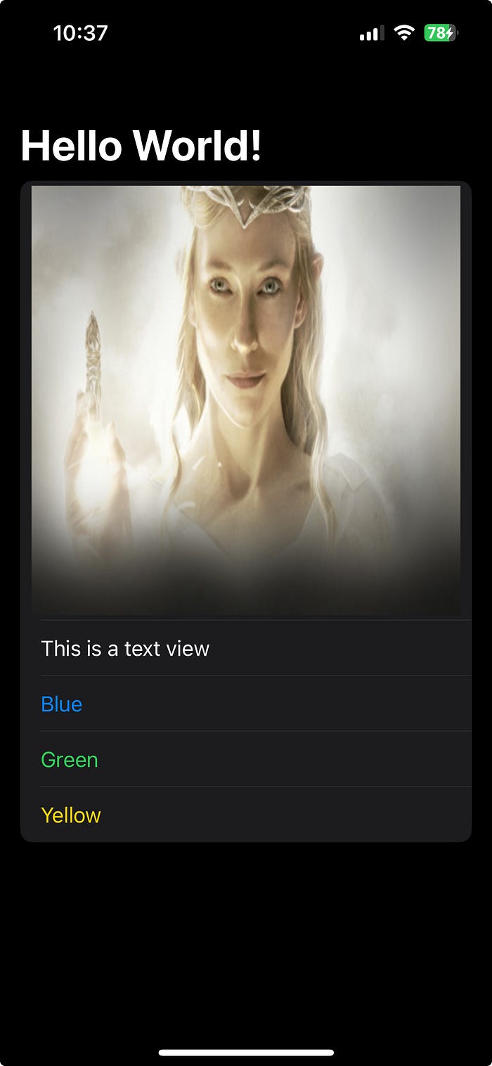
Dark Mode is built into SwiftUI, so every SwiftUI View supports dark mode by default. So the easiest first step is to simply turn on Dark Mode inside of our SwiftUI Views using preferredColorScheme(.dark).
struct NightModeView: View {
    var body: some View {
      NavigationStack {
        List {
          Image(.blindingWhite)
            .resizable()
            .frame(maxWidth: .infinity)
            .aspectRatio(1.0, contentMode: .fill)
          Text("This is a text view")
          Text("Blue").foregroundStyle(.blue)
          Text("Green").foregroundStyle(.green)
          Text("Yellow").foregroundStyle(.yellow)
        }
        .navigationTitle("Hello World!")
      }
      .preferredColorScheme(.dark)
    }
}
preferredColorScheme(_:) essentially ignores the user’s Dark Mode state, and sets the ColorScheme directly on the View. What’s even better, it changes the \.colorScheme environment value, which means that every child View will automatically inherit and observe that colorScheme.

Now the screen is dark but there is still a lot of blue light. (Remember that colors like white and green still contain blue.) Also any Image is unaffected by the colorScheme. (I remember watching The Fellowship of the Ring for the first time in theaters, and being blinded when Frodo first meets Galadriel 😵 because the screen was so bright).
Implementing a red filter
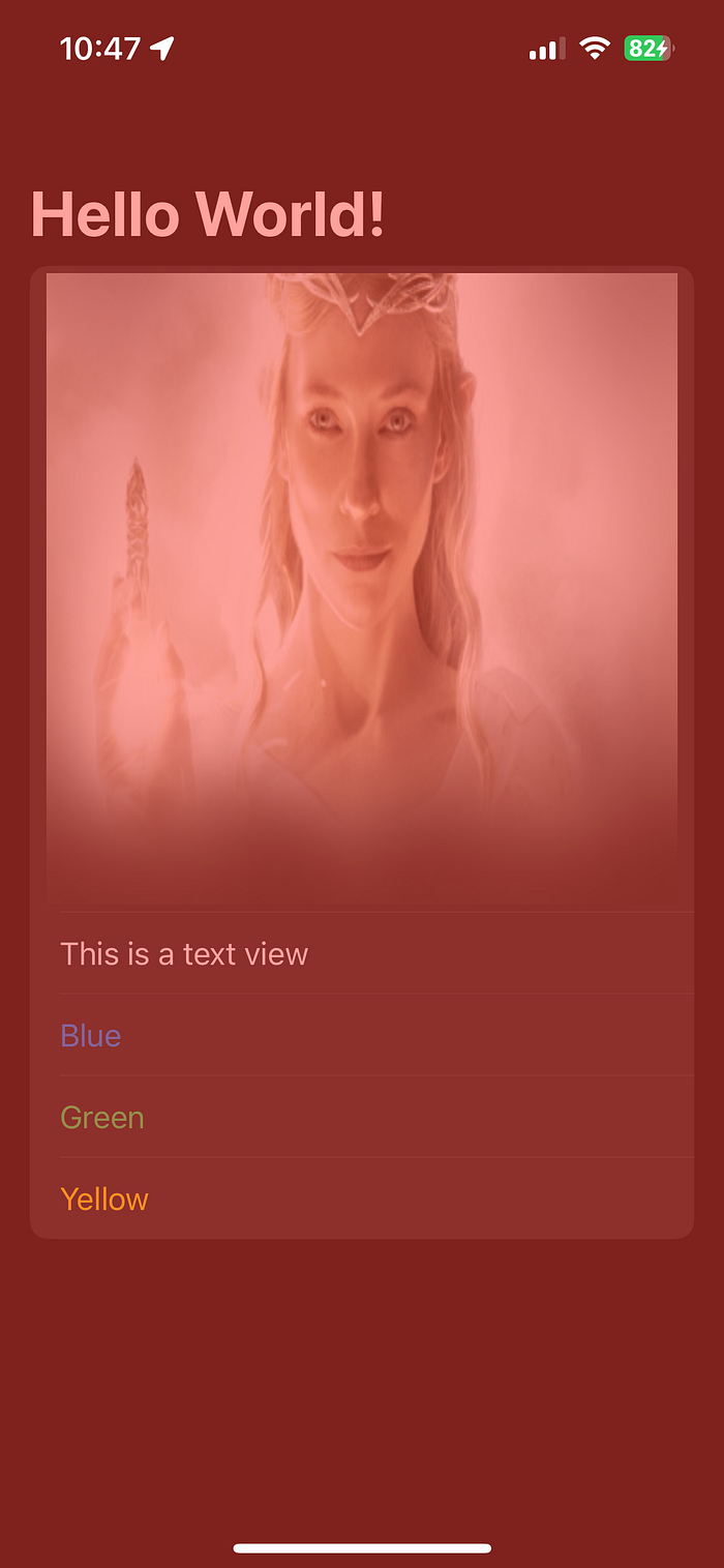
A naive approach might look like overlaying a red view with 50% opacity like so:
struct NightModeView: View {
    var body: some View {
      NavigationStack {
        List {
          Image(.blindingWhite)
            .resizable()
            .frame(maxWidth: .infinity)
            .aspectRatio(1.0, contentMode: .fill)
          Text("This is a text view")
          Text("Blue").foregroundStyle(.blue)
          Text("Green").foregroundStyle(.green)
          Text("Yellow").foregroundStyle(.yellow)
        }
        .navigationTitle("Hello World!")
      }
      .preferredColorScheme(.dark)
      .overlay {
        Color.red.opacity(0.5)
          .ignoresSafeArea()
      }
    }
}
However, while that does indeed turn the screen red (and thereby filter out most of the blue), it actually makes the screen brighter. Before the background was pitch black but now it’s red.

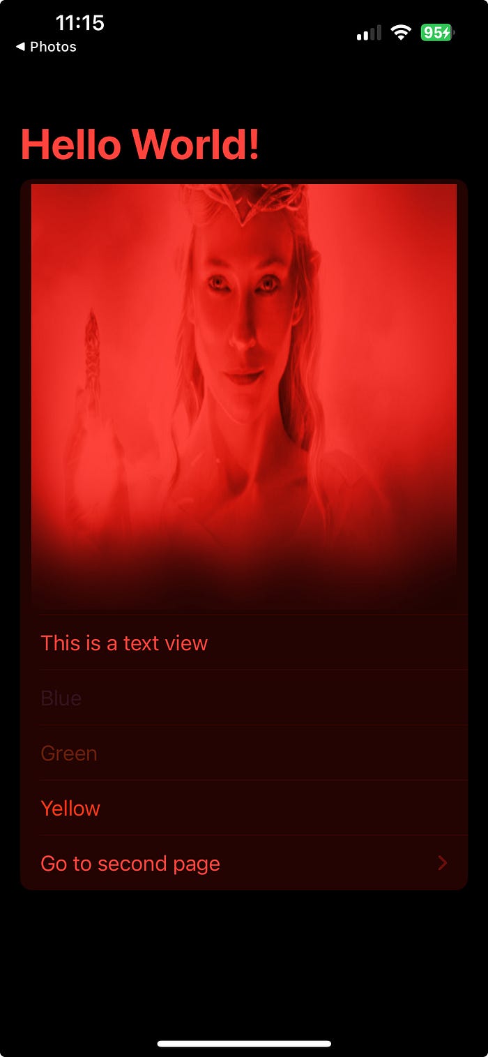
So we want to keep all black pixels black, but we want all the other colors to be a shade of red. 🤔 Thankfully, digital photo editors solved this problem long ago, and SwiftUI has added many of the same functions that we’ve been using in Photoshop for decades. I played around with a few of them and here is my best result so far:
struct NightModeView: View {
    var body: some View {
      NavigationStack {
        List {
          Image(.blindingWhite)
            .resizable()
            .frame(maxWidth: .infinity)
            .aspectRatio(1.0, contentMode: .fill)
          Text("This is a text view")
          Text("Blue").foregroundStyle(.blue)
          Text("Green").foregroundStyle(.green)
          Text("Yellow").foregroundStyle(.yellow)
          NavigationLink("Go to second page", value: "second page")
        }
        .navigationTitle("Hello World!")
        .navigationDestination(for: String.self) { string in
          Text(string)
        }
      }
      .monochromed(color: .red)
    }
}

extension View {
  func monochromed(color: Color, colorScheme: ColorScheme = .dark) -> some View {
    let filter: some View = color
      .blendMode(.color)
      .opacity(0.5)
      .allowsHitTesting(false)

    return self
      .preferredColorScheme(colorScheme)
      .tint(color)
      .overlay {
        filter
          .ignoresSafeArea()
      }
      .colorMultiply(color)
  }
}

Wow, I feel like I turned my iPhone into a VirtualBoy!
Let’s explain how we did this. I made a new function called monochromed(color: colorScheme:) so in the future we can add Night Mode with a single line of code. The color: parameter is what color we want the whole screen to be. In our case, we’ll use .red . Next, the colorScheme: can be light or dark but it defaults to dark.
monochromed(color:) essentially does the same thing as our earlier example. It overlays a red View. However, the View that it overlays is slightly more sophisticated. First we start off with the same red view. Then we add .blendMode(.color). Like many functions we’ll be using here, blend mode should be fairly familiar to anyone who’s worked in photo editors. Trailing Closure has a fantastic cheat sheet about all the available blend modes in SwiftUI. In it we can see:
.colorThe Color blend mode preserves the luma of the bottom layer, while adopting the hue and chroma of the top layer.
🤷🏼♂️ i.e. It blends the colors together.
opacity(0.5) I played around with the opacity of this filter a bit and so far 50% was my favorite. 100% made everything too bright red, and 25% didn’t filter out other colors enough.
.colorMultiply(color) : This SwiftUI function adds a color multiplication effect. This is in fact another blend mode that we can find in most photo editors. Wikipedia states:
Multiply blend mode takes the RGB channel values from 0 to 1 of each pixel in the top layer and multiples them with the values for the corresponding pixel from the bottom layer. Wherever either layer was brighter than black, the composite is darker; since each value is less than 1, their product will be less than each initial value that was greater than zero.
Again 🤷🏼♂️. But my very limited understanding is that this is what enables the black pixels to remain black. A black pixel has an RGB channel value of 0. So anything multiplied by 0 is 0, i.e. black pixels stay black. Notice that .colorMultiply is applied to the View itself and not the overlayed filter View. Next let’s look at a few quality of life improvements.
.allowsHitTesting(false) : If we didn’t have this then no touch events would reach our Views at all, since we’d be touching the red filter view and not the views underneath.
.tint(color) : We are essentially filtering out every color except for red. So why not change the tint of our app to match, so that it doesn’t get filtered out. This is extra important because the default tint color in SwiftUI is blue. Remember, the entire point of a Night Mode is to filter out blue light, so by monochroming to red, we are effectively filtering out blue. Anything that is not red is going to be harder to see, and the further it is from red, the less visible it will be, meaning that blue is practically invisible now. The entire point of tint in SwiftUI is to highlight certain elements to the user. So while using our filter, it makes sense to match our tint to the color of the filter so that our tinted elements remain highly visible.
Room for improvement
As much as I love Night Mode, and I impatiently wait for Apple to roll out Night Mode everywhere, it makes sense that Apple has only rolled out this feature to two small niche areas. Design systems are hard. As we can see there are many edge cases. We’ve covered many edge cases so far. For example, this solution now effectively turns every pixel in every SwiftUI View into either black or a shade of red. However, it creates new problems. Anything blue is effectively invisible, rendering many apps unusable. In addition, many Views will lose contrast and legibility. For example, look at the green Text. It’s still visible, but it is much harder to read. These are all design problems that we will work on as an industry over the next several years.
I expect that the industry will slowly have a transition to supporting Night Mode everywhere, just as we are still transitioning to supporting Dark Mode everywhere. Dark Mode used to be extremely difficult to adopt in UIKit, but with SwiftUI, Apple made it trivial. Now Dark Mode is not just on Apple and Android apps, but it’s almost everywhere, even in our operating systems and many websites. I hope that one day soon, Apple sherlocks this implementation and simply makes it a baked in part of the system. I also hope that over time Night Mode will be adopted everywhere. But we must recognize that that is a gargantuan task. It will require designers and engineers everywhere to change their workflow, and the transition will take years.
Is all of that work worth it? Absolutely, yes! Screens are here to stay, whether we like it or not. Yet we are currently in the middle of a sleep deprivation crisis. For more information on how important sleep is, and how disasterous light from devices can be, I highly recommond this podcast by Andrew Huberman. The point is that users shouldn’t have to choose between your wonderful app and their sleep. And we shouldn’t be making software that negatively impacts our user’s health. Period.
Thankfully, there is a solution, and it’s not that hard to implement. It’s not perfect, but it’s a start. Do your users a favor and adopt the option for Night Mode. And do yourself a favor. Adopt Night Mode. I wouldn’t be surprised if Night Mode becomes very popular in the near future, just like Dark Mode. If so, then many users will crave, no, demand Night Mode. Night Mode could not only differentiate you from other apps, it could actually be the thing preventing users from choosing your app. Let me be clear. I don’t want to give you false hype. Night Mode is not a silver bullet, just as Night Shift and Dark Mode were not silver bullets. But soon Night Mode will be another important tool in our tool belt toward building healthy sleep. You’d be a fool not to adopt it.
Conclusion
In this tutorial we learned how incredibly harmful device lights can be to your sleep and therefore health. We saw how Apple made a powerful filter called Night Mode that we too can adopt with a few lines of code.
I’ve created a public gist where you can try out this implementation for yourself. If you like it, please ⭐ Star it.
Next time, we will learn how to make our Night Mode more dynamic so that the user can turn it on and off. We will also learn how to tell child views that they are in Night Mode so that they can present themselves more legibly.
Comments powered by Talkyard.